Brand Story HOME > Brand Story

[Brand Name]
Combining ‘Gim’ with ‘sp’ (special, sprinkle, spend, spice, etc.), the brand conveys Seocheon Gim’s uniqueness through various storytelling elements, such as its special qualities, enjoyable moments with seaweed, and its aromatic appeal. Additionally, the ‘sp’ ending enhances the crispy texture associated with snacks.
[Brand Design]
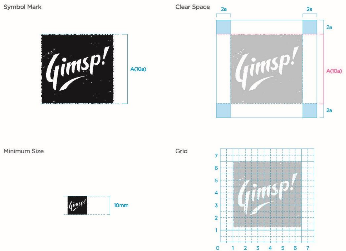
The logo design uses a seaweed-inspired frame to express the special and joyful feeling of enjoying delicious food. The upward-sloping logo and curved bottom intuitively convey a sense of uplift and excitement, ending with a visual exclamation mark. The distinctive font style highlights Seocheon Gim’s unique and differentiated identity.
[Key Claim / Head Copy / Slogan]
"Special Seaweed in Korea"
Develop a natural expression of Seocheon Gim's high quality among premium Korean seaweeds,
highlighting the special image also embodied in the international brand Gimsp.
highlighting the special image also embodied in the international brand Gimsp.
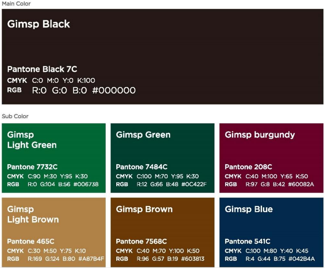
[Logo Mark Color Guidelines, Download]